
Visual harmony is a fundamental concept in the realm of art and design, serving as the backbone of aesthetic appeal. It refers to the pleasing arrangement of elements within a composition, creating a sense of unity and coherence that resonates with the viewer. When visual harmony is achieved, the various components of a piece work together seamlessly, evoking emotions and guiding the observer’s gaze in a manner that feels both natural and engaging.
This concept is not merely about beauty; it encompasses the effective communication of ideas and feelings through visual means. At its core, visual harmony is about balance and proportion, but it also extends to the relationships between colours, shapes, and textures. Artists and designers strive to create a sense of order amidst chaos, allowing viewers to navigate their work with ease.
The importance of visual harmony cannot be overstated; it is what transforms a mere collection of elements into a cohesive narrative or experience. Understanding this principle is essential for anyone looking to create impactful art or design, as it lays the groundwork for all subsequent decisions regarding composition and style.
Elements of Visual Harmony
Interplay of Elements
For instance, lines can guide the viewer’s eye through a composition, whilst shapes can create focal points that draw attention. When these elements are thoughtfully combined, they can evoke specific emotions or convey particular messages. Moreover, the relationship between these elements is crucial in establishing visual harmony.
Balance and Harmony
For example, a well-balanced composition may feature contrasting shapes that complement one another, or a harmonious colour palette that unifies disparate elements. The key lies in understanding how these components work together to create a cohesive whole. Artists often experiment with different combinations of elements to discover what resonates best with their intended message or aesthetic.
Creativity and Innovation
This exploration is not only vital for achieving visual harmony but also for fostering creativity and innovation within the artistic process.
Colour and Visual Harmony

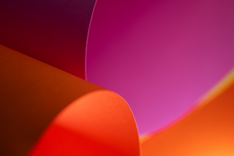
Colour is one of the most powerful tools in an artist’s arsenal when it comes to achieving visual harmony. It has the ability to evoke emotions, set moods, and create focal points within a composition. The careful selection and arrangement of colours can significantly influence how a viewer perceives a piece of art or design.
For instance, warm colours such as reds and yellows can create feelings of warmth and energy, while cool colours like blues and greens often evoke calmness and serenity. Understanding colour theory—particularly concepts such as complementary colours, analogous colours, and colour temperature—is essential for artists seeking to create harmonious compositions. In addition to individual colours, the overall colour palette plays a crucial role in establishing visual harmony.
A limited colour palette can create a sense of unity and cohesiveness, while a more diverse palette can introduce complexity and interest. However, it is important to strike a balance; too many competing colours can lead to visual chaos rather than harmony. Artists often use techniques such as colour blocking or gradient transitions to create smooth transitions between colours, enhancing the overall sense of unity within their work.
Ultimately, colour serves as both a means of expression and a vehicle for achieving visual harmony.
Balance and Visual Harmony
Balance is another critical aspect of visual harmony that artists must consider when creating their work. It refers to the distribution of visual weight within a composition, ensuring that no single element overwhelms the others. There are two primary types of balance: symmetrical and asymmetrical.
Symmetrical balance involves mirroring elements on either side of a central axis, creating a sense of stability and order. In contrast, asymmetrical balance achieves harmony through the careful placement of dissimilar elements that still maintain an overall sense of equilibrium. The choice between symmetrical and asymmetrical balance often depends on the desired emotional impact of the piece.
Symmetrical compositions tend to evoke feelings of calmness and formality, while asymmetrical arrangements can convey dynamism and movement. Artists frequently experiment with different types of balance to find the most effective way to communicate their message. By understanding how balance contributes to visual harmony, artists can create compositions that resonate deeply with viewers, drawing them into the narrative or emotion being portrayed.
Proportion and Visual Harmony
Proportion refers to the relative size and scale of elements within a composition, playing a vital role in achieving visual harmony. The relationship between different components can significantly affect how viewers perceive a piece of art or design. For instance, using the golden ratio—a mathematical ratio often found in nature—can create aesthetically pleasing proportions that are inherently satisfying to the eye.
This principle has been employed by artists throughout history, from Leonardo da Vinci to contemporary designers. In addition to mathematical ratios, artists must also consider how proportion affects the overall narrative or message of their work. For example, exaggerating certain elements can draw attention to specific themes or ideas, while minimising others can create a sense of depth or perspective.
The key lies in finding the right balance between proportionate elements to achieve visual harmony without sacrificing clarity or meaning. By thoughtfully considering proportion in their compositions, artists can enhance their work’s emotional impact and ensure that it resonates with viewers on multiple levels.
Texture and Visual Harmony
Texture is an often-overlooked element in discussions of visual harmony, yet it plays an essential role in creating depth and interest within a composition. Texture refers to the surface quality of an object—whether it is smooth, rough, soft, or hard—and can be both tactile and visual. In art and design, texture can be created through various techniques such as brushwork, layering materials, or digital manipulation.
The interplay between different textures can add richness to a piece, enhancing its overall aesthetic appeal. Incorporating texture into a composition can also contribute to visual harmony by creating contrast and variety without overwhelming the viewer. For instance, combining smooth areas with rough textures can create dynamic tension that draws the eye across the piece while maintaining an overall sense of unity.
Additionally, texture can evoke specific emotions; for example, soft textures may convey comfort or warmth, while harsh textures might suggest tension or conflict. By thoughtfully integrating texture into their work, artists can elevate their compositions and create a more immersive experience for viewers.
Visual Harmony in Art and Design
Visual harmony is not confined solely to fine art; it extends into various fields of design as well. From graphic design to interior design, the principles of visual harmony are essential for creating effective and engaging compositions. In graphic design, for instance, harmonious layouts ensure that text and images work together cohesively to communicate messages clearly.
Designers often employ grids and alignment techniques to achieve balance and proportion within their work. In interior design, visual harmony plays a crucial role in creating spaces that feel inviting and cohesive. The careful selection of colours, furniture arrangements, and decorative elements can transform a room into a harmonious environment that promotes relaxation or productivity.
Designers often consider factors such as scale and proportion when selecting furnishings to ensure that each element contributes positively to the overall aesthetic. By applying principles of visual harmony across various disciplines, artists and designers can create experiences that resonate deeply with their audiences.
Creating Visual Harmony in Your Space
Creating visual harmony in your own space involves thoughtful consideration of various elements such as colour, balance, proportion, texture, and arrangement. Start by assessing your existing environment; identify areas where visual chaos may exist due to clashing colours or overcrowded spaces. A harmonious space often begins with a cohesive colour palette that reflects your personal style while promoting a sense of tranquillity.
Next, consider the balance within your space—both visually and functionally. Arrange furniture in a way that encourages flow while ensuring that no single element dominates the room’s aesthetic. Incorporating various textures through textiles or decorative objects can add depth without overwhelming the senses.
Finally, pay attention to proportion; select furnishings that complement one another in size and scale to create an inviting atmosphere. By applying these principles of visual harmony in your space, you can cultivate an environment that not only reflects your personality but also promotes well-being and creativity. Whether you are an artist seeking inspiration or simply looking to enhance your living space, understanding visual harmony will empower you to make informed decisions that elevate your surroundings into cohesive works of art in their own right.
Visual harmony is a crucial aspect of art that can be seen in various paintings throughout history. One such example is the painting “Mother with Two Children” (1915-1917) by Egon Schiele. This masterpiece showcases a perfect balance of colours, shapes, and composition, creating a sense of unity and coherence. For more insights into the importance of harmony in art, you can explore the article on “Resurrection of Christ” (c. 1460) by Piero della Francesca here. This article delves into how visual harmony plays a significant role in conveying the message and emotions of a painting.
