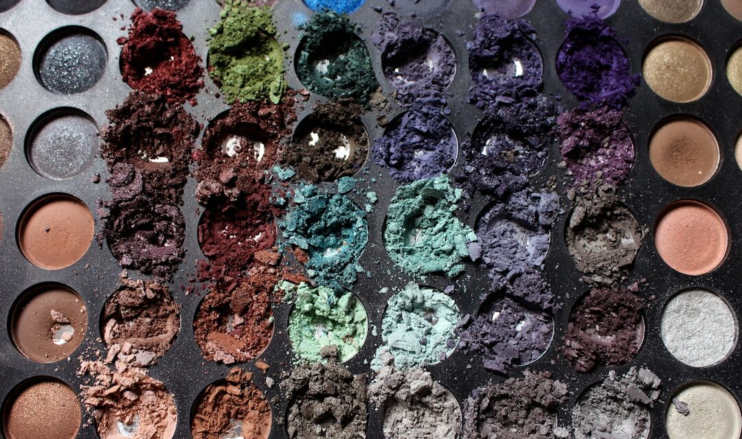
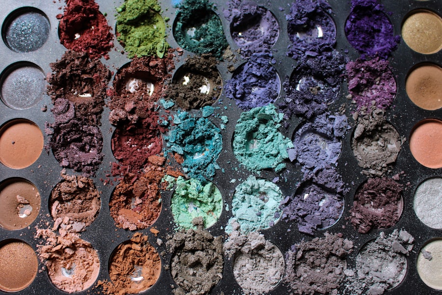
Colour palette play is an essential aspect of both art and design, serving as the foundation upon which visual narratives are built. At its core, a colour palette is a selection of colours that work harmoniously together, creating a cohesive visual experience. Understanding the basics of colour theory is crucial for artists and designers alike, as it allows them to manipulate hues, shades, and tones to evoke specific emotions and responses from their audience.
The interplay of colours can dramatically alter the perception of a piece, making it vital to grasp how different colours interact with one another. The primary colours—red, blue, and yellow—serve as the building blocks for all other colours. By mixing these hues, one can create secondary colours such as green, orange, and purple.
Furthermore, the concept of warm and cool colours adds another layer of complexity to colour palette play. Warm colours, like reds and yellows, tend to evoke feelings of energy and warmth, while cool colours, such as blues and greens, often convey calmness and serenity. Understanding these fundamental principles allows artists to make informed decisions when selecting their colour palettes, ultimately enhancing the emotional impact of their work.
Choosing the Right Colour Palette for Your Project
Selecting the appropriate colour palette for a project is a nuanced process that requires careful consideration of various factors. The first step is to define the purpose of the artwork or design. Is it meant to inspire joy, provoke thought, or convey a sense of tranquillity?
Once the intention is clear, artists can begin to explore colour combinations that align with their vision. For instance, a project aimed at evoking excitement might benefit from vibrant, contrasting colours, while a more subdued piece may call for softer, analogous hues. Another critical aspect to consider is the target audience.
Different demographics may respond differently to certain colours based on cultural associations and personal experiences. For example, while red may signify love and passion in many Western cultures, it can also represent danger or warning in others. Therefore, understanding the cultural context of colour can significantly influence the effectiveness of a chosen palette.
Additionally, artists should consider the medium they are working with; certain colours may appear differently when applied in paint versus digital formats, necessitating adjustments to achieve the desired effect.
Exploring Different Colour Schemes and Combinations
Diving into various colour schemes can open up a world of possibilities for artists and designers. The most common schemes include monochromatic, analogous, complementary, triadic, and tetradic combinations. A monochromatic scheme utilises variations in lightness and saturation of a single hue, creating a harmonious yet dynamic effect.
This approach can be particularly effective in conveying mood or atmosphere without overwhelming the viewer with too many competing colours. Analogous colour schemes involve selecting colours that are adjacent to each other on the colour wheel. This method creates a sense of unity and cohesion while still allowing for some variation in tone.
Complementary schemes, on the other hand, utilise colours that are opposite each other on the wheel, resulting in high contrast and vibrancy. This technique can be particularly striking when used sparingly to draw attention to specific elements within a composition. Triadic schemes consist of three evenly spaced colours on the wheel, offering a balanced yet lively palette that can energise a piece.
Lastly, tetradic combinations involve four colours arranged into two complementary pairs, providing a rich tapestry of hues that can be both complex and visually engaging.
Tips and Tricks for Effective Palette Play
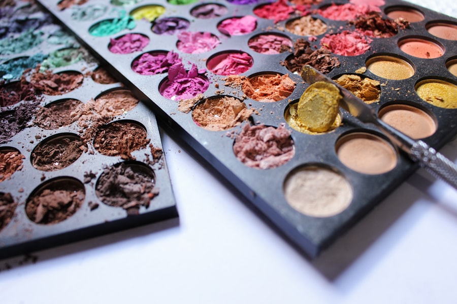
To master the art of colour palette play, artists can employ several tips and tricks that enhance their creative process. One effective strategy is to create a mood board or colour swatch collection that reflects the desired emotions or themes of the project. This visual reference can serve as inspiration and guide decision-making throughout the artistic journey.
Additionally, experimenting with different shades and tints can help artists discover unexpected combinations that resonate with their vision. Another useful technique is to limit the number of colours in a palette. While it may be tempting to include every hue that inspires you, a more focused approach often leads to stronger compositions.
By selecting a few key colours and using them strategically throughout the piece, artists can create a sense of harmony and coherence that draws the viewer’s eye. Furthermore, considering the balance between warm and cool tones can add depth and dimension to a work, enhancing its overall impact.
Utilising Colour Psychology in Palette Play
Colour psychology plays a pivotal role in how viewers perceive and respond to art and design. Each colour carries its own set of associations and meanings that can influence emotions and behaviours. For instance, blue is often associated with calmness and trustworthiness, making it a popular choice for corporate branding.
In contrast, yellow evokes feelings of happiness and optimism but can also be overwhelming if overused. Understanding these psychological implications allows artists to harness the power of colour effectively in their work. When selecting a colour palette, artists should consider not only their personal preferences but also how their choices will resonate with their audience.
For example, if an artist aims to create a piece that promotes relaxation or mindfulness, incorporating soft blues and greens may be more effective than bold reds or oranges. By aligning their colour choices with psychological principles, artists can create works that not only captivate visually but also engage viewers on an emotional level.
Incorporating Trends and Personal Style in Colour Palettes
In the ever-evolving world of art and design, trends play a significant role in shaping colour palettes. Staying informed about current trends can provide valuable insights into what resonates with audiences at any given time. For instance, recent years have seen a rise in earthy tones and muted palettes as people seek comfort and connection with nature in their surroundings.
However, while trends can serve as inspiration, it is essential for artists to maintain their unique voice and style within their work. Incorporating personal style into colour palettes involves reflecting on individual preferences and experiences. Artists should consider what colours resonate with them personally and how these choices can be integrated into their projects.
This fusion of trend awareness and personal expression creates a distinctive aesthetic that sets an artist apart from others in their field. Ultimately, finding this balance allows for authentic creativity while still appealing to contemporary tastes.
The Impact of Colour Palette Play in Design and Art
The impact of colour palette play extends far beyond mere aesthetics; it influences how viewers engage with art and design on multiple levels. A well-considered colour palette can evoke specific emotions, guide the viewer’s eye through a composition, and even communicate messages without words. In branding and marketing, for instance, companies carefully select colour palettes that align with their values and target audience to create memorable identities that resonate with consumers.
In fine art, colour palettes can transform an ordinary scene into something extraordinary by evoking mood and atmosphere. Artists like Claude Monet utilised colour to capture fleeting moments in nature, while contemporary artists experiment with bold palettes to challenge perceptions and provoke thought. The choices made in colour palette play ultimately shape the narrative of a piece, making it an indispensable tool for any artist or designer seeking to leave a lasting impression.
Experimenting with Unconventional Colour Palettes
While traditional colour palettes have their merits, experimenting with unconventional combinations can lead to exciting discoveries in art and design. Breaking away from established norms allows artists to push boundaries and explore new creative territories. For instance, pairing unexpected colours—such as vibrant pinks with deep greens—can create striking contrasts that capture attention and spark curiosity.
Moreover, embracing unconventional palettes encourages artists to think outside the box and challenge preconceived notions about colour relationships. This experimentation can lead to innovative techniques and styles that redefine artistic expression. By allowing oneself the freedom to explore unusual combinations without fear of judgement or failure, artists can unlock new dimensions in their work that resonate deeply with both themselves and their audience.
In conclusion, mastering colour palette play is an essential skill for any artist or designer seeking to enhance their creative practice. By understanding the fundamentals of colour theory, choosing appropriate palettes for specific projects, exploring various schemes, utilising colour psychology, incorporating trends while maintaining personal style, recognising the impact of colour choices on viewer engagement, and daring to experiment with unconventional combinations, artists can elevate their work to new heights. Ultimately, colour is not merely an aesthetic choice; it is a powerful tool that shapes narratives and evokes emotions in ways that words alone cannot convey.
Palette Play is a fascinating concept that can be seen in various art pieces throughout history. One such example is Helen Frankenthaler’s “Mountains and Sea” from 1952. This abstract expressionist painting showcases the artist’s innovative use of colour and technique, creating a mesmerising visual experience. To learn more about another artist’s use of colour and technique, check out this article on Titian’s “Bacchanals” from 1523-1526 here.


