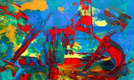
Colour is an essential element of visual art, serving not only as a means of representation but also as a powerful tool for expression and communication. The study of colour, often referred to as colour studies, delves into the complexities of how colours interact, evoke emotions, and influence perception. Artists and designers alike have long recognised the significance of colour in their work, understanding that it can dramatically alter the mood and impact of a piece.
By engaging in colour studies, one can develop a deeper appreciation for this vital aspect of art, enhancing both their creative practice and their ability to convey ideas effectively. In the realm of art, colour is not merely a decorative element; it is a language in its own right. Each hue carries its own connotations and associations, which can vary across cultures and contexts.
For instance, red may evoke feelings of passion or danger, while blue often conveys calmness or sadness. By exploring colour studies, artists can learn to harness these emotional responses, using colour strategically to guide the viewer’s experience. This exploration is not limited to traditional painting or drawing; it extends to digital design, photography, and even architecture, making colour studies a fundamental aspect of all visual disciplines.
Summary
- Color studies are essential for understanding the use of color in art and design.
- Understanding color theory is crucial for creating harmonious and visually appealing compositions.
- Quick exercises can help improve confidence in using color effectively.
- Different color combinations can evoke different emotions and moods in art and design.
- Exploring color relationships and experimenting with light and shadow can add depth and dimension to artwork.
Understanding Color Theory
Understanding the Colour Wheel
Colour theory encompasses various concepts, including the colour wheel, primary and secondary colours, complementary colours, and analogous colours. The colour wheel, developed by Isaac Newton in the 17th century, serves as a foundational tool for understanding colour relationships. It illustrates the spectrum of colours and their interconnections, providing artists with a visual reference for mixing and matching hues.
Primary and Secondary Colours
Primary colours—red, blue, and yellow—are the building blocks from which all other colours are derived. When mixed together in various combinations, they produce secondary colours: green (blue and yellow), orange (red and yellow), and purple (red and blue). This foundational knowledge allows artists to create a wide range of colours while maintaining an understanding of their relationships.
Creating Harmony with Complementary and Analogous Colours
Complementary colours, which are located opposite each other on the colour wheel, create striking contrasts when used together. For example, pairing blue with orange can produce a vibrant visual dynamic that captures attention. Conversely, analogous colours—those that sit next to each other on the wheel—create a more subtle harmony that can evoke a sense of unity within a composition.
Quick Exercises to Improve Color Confidence
Building confidence in using colour is essential for any artist or designer looking to enhance their work. One effective way to achieve this is through quick exercises that encourage experimentation and playfulness with colour. One such exercise involves selecting a limited palette of three or four colours and creating a series of small sketches or paintings using only those hues.
This constraint forces the artist to think creatively about how to mix and apply colours while developing an understanding of their interactions. Over time, this practice can lead to greater confidence in making bold colour choices. Another valuable exercise is to create a colour journal.
In this journal, artists can document their observations of colour in the world around them—whether it be the vibrant hues of a sunset or the subtle tones found in nature. By capturing these moments through sketches or written descriptions, artists can begin to internalise their understanding of colour relationships and develop a personal vocabulary for expressing their ideas. This practice not only enhances colour awareness but also fosters a deeper connection to the environment, ultimately enriching an artist’s creative process.
Using Different Color Combinations
The exploration of different colour combinations is crucial for artists seeking to create visually compelling works. Each combination can evoke distinct emotions and responses from viewers, making it essential to consider how colours interact within a composition. One popular approach is the use of triadic colour schemes, which involve selecting three colours that are evenly spaced on the colour wheel.
This method creates a balanced yet dynamic composition that can draw the viewer’s eye across the artwork. In contrast, monochromatic colour schemes focus on variations of a single hue, exploring its different shades, tints, and tones. This approach allows artists to delve into the nuances of a particular colour while creating a sense of cohesion within their work.
By experimenting with both triadic and monochromatic combinations, artists can develop a more nuanced understanding of how colours can be used to convey meaning and emotion effectively.
Exploring Color Relationships
Understanding colour relationships is fundamental to mastering the use of colour in art and design. These relationships can be classified into several categories: complementary, analogous, triadic, and split-complementary schemes. Each type offers unique opportunities for creating visual interest and emotional resonance within a piece.
Complementary colours provide stark contrasts that can energise a composition, while analogous colours create harmony and unity through their close proximity on the colour wheel. Artists can also explore the concept of warm and cool colours when considering relationships. Warm colours—such as reds, oranges, and yellows—tend to evoke feelings of warmth and energy, while cool colours—like blues and greens—convey calmness and serenity.
By thoughtfully combining warm and cool hues within a composition, artists can create depth and dimension, guiding the viewer’s emotional response to the artwork.
Experimenting with Light and Shadow
Light and shadow play an integral role in how we perceive colour in art. The way light interacts with surfaces can dramatically alter our perception of hue, saturation, and value. Artists must consider these factors when applying colour to their work, as they can influence the overall mood and atmosphere of a piece.
Experimenting with light and shadow allows artists to explore how different lighting conditions affect their chosen colours. One effective exercise is to create studies based on natural light at different times of day. For instance, observing how sunlight changes throughout the day—from the soft pastels of dawn to the harsh contrasts of midday—can provide valuable insights into how light influences colour perception.
By capturing these variations in sketches or paintings, artists can develop a more nuanced understanding of how to manipulate light and shadow in their work.
Building a Color Palette
Creating a cohesive colour palette is essential for any artist or designer looking to establish a distinct visual identity. A well-considered palette not only enhances the overall aesthetic of a piece but also communicates specific emotions or themes effectively. When building a colour palette, artists should consider factors such as harmony, contrast, and balance.
A harmonious palette may consist of analogous colours that create a sense of unity, while contrasting hues can add visual interest and energy. One approach to developing a colour palette is to draw inspiration from nature or existing artworks. By analysing the colours found in a particular landscape or piece of art that resonates with them, artists can identify key hues that evoke specific feelings or ideas they wish to convey in their own work.
Additionally, digital tools such as Adobe Colour or Coolors can assist artists in generating harmonious palettes based on selected colours or themes.
Applying Color Studies to Art and Design
The insights gained from colour studies are invaluable when applied to various forms of art and design. Whether creating paintings, illustrations, graphic designs, or even interior spaces, an understanding of colour theory and relationships allows artists to make informed decisions that enhance their work’s impact. For instance, in graphic design, effective use of colour can guide user experience by drawing attention to key elements or creating visual hierarchies.
In fine art, mastering colour studies enables artists to convey complex emotions and narratives through their work. By thoughtfully considering how colours interact within a composition—whether through contrasting hues or harmonious palettes—artists can create pieces that resonate deeply with viewers on both emotional and intellectual levels. Ultimately, engaging with colour studies enriches an artist’s practice by providing them with the tools necessary to explore new creative avenues while deepening their understanding of this fundamental aspect of visual expression.
If you are interested in exploring different art galleries around the world, you may want to check out An Introduction to the National Gallery Singapore, Singapore. This article provides an overview of the gallery’s history, collections, and exhibitions, giving you a glimpse into the vibrant art scene in Singapore. Pairing this with the Color Studies: Quick Exercises to Build Confidence can enhance your understanding and appreciation of art in different contexts.
FAQs
What are color studies?
Color studies are exercises or activities designed to help artists and designers improve their understanding and use of color. They often involve experimenting with different color combinations, techniques, and materials to build confidence and skill in working with color.
Why are color studies important?
Color studies are important because they help artists and designers develop a deeper understanding of color theory, improve their ability to create harmonious color schemes, and build confidence in using color effectively in their work. They also provide an opportunity to explore and experiment with different color combinations and techniques.
What are some quick exercises for building confidence in color studies?
Some quick exercises for building confidence in color studies include creating color swatches using different mediums, experimenting with color mixing to create new shades and tones, practicing color gradients and transitions, and studying the work of other artists to analyze their use of color.
How can color studies help improve artistic skills?
Color studies can help improve artistic skills by providing a structured way to practice and experiment with color. By engaging in color studies, artists can develop a better understanding of color theory, improve their ability to create visually appealing compositions, and gain confidence in using color effectively in their work.
What materials are commonly used for color studies?
Common materials used for color studies include colored pencils, markers, watercolors, acrylic paints, oil paints, pastels, and digital art software. Different materials offer unique opportunities for exploring color and can be used to create a variety of effects and techniques in color studies.


