Analogous colour schemes are a fundamental concept in the realm of colour theory, characterised by the use of colours that are adjacent to each other on the colour wheel. This harmonious arrangement typically consists of three to five colours, with one dominant hue complemented by its neighbouring shades. For instance, a palette might include blue, blue-green, and green, creating a visually cohesive and pleasing aesthetic.
The beauty of analogous colours lies in their ability to evoke a sense of unity and tranquillity, making them particularly effective in various artistic expressions. The appeal of analogous colour schemes is rooted in their natural occurrence in the environment. Many landscapes, for example, exhibit these colour relationships, such as the soft greens and yellows of a sunlit meadow or the warm oranges and reds of a sunset.
Artists often draw inspiration from these natural palettes, using them to create works that resonate with viewers on an emotional level. By understanding the principles behind analogous colours, artists can harness their power to convey mood and atmosphere in their creations.
Summary
- Analogous color schemes use colors that are next to each other on the color wheel
- Use analogous color schemes to create harmony and unity in your artwork
- Blend analogous colors smoothly to create transitions and gradients
- Analogous color schemes can evoke different emotions and moods in art
- Consider the temperature and intensity of colors when choosing an analogous color scheme
How to Use Analogous Color Schemes in Art
Incorporating analogous colour schemes into artwork can significantly enhance its visual impact. One effective approach is to select a dominant colour that serves as the focal point of the piece. This dominant hue can be used in larger areas or more prominent elements, while the adjacent colours can be applied in smaller doses to create depth and interest.
For example, an artist might choose a vibrant red as the primary colour, using softer pinks and oranges to accentuate certain features or backgrounds. This technique not only draws the viewer’s eye but also establishes a sense of harmony throughout the composition. Moreover, artists can experiment with varying the intensity and saturation of their chosen colours to create dynamic contrasts within the analogous scheme.
By incorporating lighter or darker shades of the same hues, one can achieve a more nuanced and layered effect. This method allows for greater expression and can evoke different emotions depending on how the colours interact with one another. For instance, a painting dominated by soft pastels may convey a sense of calmness, while bolder, more saturated colours can evoke energy and excitement.
Creating Smooth Transitions with Analogous Color Schemes
One of the most compelling aspects of using analogous colour schemes is their ability to facilitate smooth transitions between colours. This quality is particularly advantageous when creating gradients or blending techniques in painting. By gradually shifting from one colour to its neighbour on the colour wheel, artists can achieve seamless transitions that enhance the overall composition.
For instance, an artist might blend from a deep blue into a turquoise and then into a soft green, creating a serene water scene that feels fluid and organic. To master this technique, artists should consider the application methods they employ. Techniques such as wet-on-wet blending in watercolour or oil painting can yield beautiful results when working with analogous colours.
Additionally, layering transparent glazes can allow for subtle shifts in tone and hue, further enriching the visual experience. The key is to maintain a sense of balance and cohesion throughout the transitions, ensuring that each colour complements rather than competes with its neighbours.
The Psychology of Analogous Color Schemes
The psychological impact of colour cannot be overstated, and analogous colour schemes are no exception. Each colour carries its own emotional weight and cultural significance, which can influence how viewers perceive a piece of art. For instance, blues are often associated with calmness and serenity, while greens evoke feelings of growth and renewal.
When these colours are used together in an analogous scheme, they can amplify these emotions, creating a powerful narrative within the artwork. Furthermore, analogous colour schemes can also foster a sense of connection and harmony among viewers. The gentle transitions between colours can evoke feelings of comfort and familiarity, making it easier for individuals to engage with the artwork on a deeper level.
This emotional resonance is particularly important in art intended to convey specific themes or messages. By carefully selecting colours that align with the desired emotional response, artists can create works that resonate profoundly with their audience.
Tips for Choosing Colors in an Analogous Color Scheme
When selecting colours for an analogous colour scheme, it is essential to consider both personal preference and the intended message of the artwork. A good starting point is to choose a primary colour that resonates with the theme or emotion you wish to convey. From there, explore adjacent colours on the colour wheel that complement this hue while also providing variety.
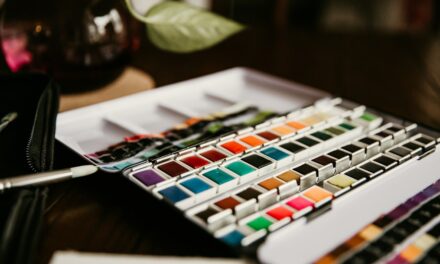
It is often helpful to create swatches or small studies to see how these colours interact before committing to a larger piece. Another important consideration is the balance between warm and cool tones within the scheme. While analogous colours are typically harmonious, introducing a mix of warm and cool hues can add depth and complexity to the artwork.
For example, combining warm yellows with cool greens can create an intriguing contrast that draws attention without disrupting the overall unity of the piece. Ultimately, trust your instincts as an artist; experimentation is key to discovering unique combinations that resonate with your vision.
Examples of Analogous Color Schemes in Art
Throughout art history, numerous artists have effectively employed analogous colour schemes to create captivating works. One notable example is Claude Monet’s “Water Lilies” series, where he masterfully blends shades of blue, green, and violet to depict serene water scenes filled with reflections and light. The harmonious use of these adjacent colours not only captures the essence of nature but also evokes a sense of tranquillity that invites viewers into his world.
Another prominent example can be found in Vincent van Gogh’s “Starry Night,” where he utilises a palette dominated by blues and yellows. The swirling sky is brought to life through the interplay of these analogous hues, creating a dynamic yet cohesive composition that conveys both movement and emotion. Such examples illustrate how effectively analogous colour schemes can be used to enhance visual storytelling and evoke powerful responses from viewers.
Analogous Color Schemes in Different Art Forms
Analogous colour schemes are not limited to traditional painting; they can be found across various art forms, including graphic design, interior design, and even fashion. In graphic design, for instance, designers often utilise analogous colours to create visually appealing layouts that guide the viewer’s eye through information seamlessly. By employing these harmonious palettes, they can establish brand identities that resonate with target audiences.
In interior design, analogous colour schemes are frequently used to create cohesive spaces that feel inviting and comfortable. A living room adorned with soft greens and blues can evoke a sense of calmness, making it an ideal environment for relaxation. Similarly, fashion designers often draw upon analogous colours to create striking collections that harmonise well together while allowing for individual expression through varied styles.
Experimenting with Analogous Color Schemes in Your Art
As an artist seeking to incorporate analogous colour schemes into your work, experimentation is essential for discovering your unique style and voice. Begin by creating small studies or sketches using different combinations of adjacent colours on the colour wheel. This practice will not only help you understand how these colours interact but also allow you to explore various techniques for blending and layering.
Additionally, consider stepping outside your comfort zone by experimenting with unexpected combinations within your chosen scheme. For instance, introducing an unusual accent colour or varying the saturation levels can lead to exciting results that challenge traditional notions of harmony. Embrace the process of trial and error; each attempt will contribute to your growth as an artist and deepen your understanding of how analogous colours can enhance your work.
In conclusion, mastering analogous colour schemes opens up a world of possibilities for artists seeking to create harmonious and emotionally resonant works. By understanding their principles and experimenting with various techniques, artists can harness the power of these colour relationships to elevate their art and connect more profoundly with their audience. Whether through painting, design, or other creative forms, analogous colours offer a rich palette for expression that continues to inspire artists across generations.
Analogous color schemes are essential in creating cohesive and harmonious art pieces. To further enhance your understanding of blending and transitioning colors smoothly, you may want to explore the article on blending and glazing in oil paint. This article delves into professional methods that can help you achieve seamless transitions in your artwork, allowing for a more polished and cohesive final product. By incorporating these techniques into your artistic practice, you can elevate your work to new levels of sophistication and visual appeal.
FAQs
What are analogous color schemes?
Analogous color schemes are created by using colors that are adjacent to each other on the color wheel. These colors are similar in tone and create a harmonious and cohesive look when used together in art or design.
How do analogous color schemes create smooth transitions in art?
Analogous color schemes create smooth transitions in art by using colors that are closely related on the color wheel. This allows for a seamless blending of colors, creating a sense of unity and flow in the artwork.
What are some examples of analogous color schemes?
Examples of analogous color schemes include using shades of red, orange, and yellow, or using shades of blue, green, and teal. These combinations create a visually pleasing and cohesive look in art and design.
How can artists use analogous color schemes effectively?
Artists can use analogous color schemes effectively by choosing a dominant color and then using the adjacent colors as accents or supporting elements. This creates a balanced and harmonious composition while allowing for subtle variations in color.
What are the benefits of using analogous color schemes in art?
The benefits of using analogous color schemes in art include creating a sense of harmony and unity, as well as allowing for smooth transitions between colors. This can result in a visually pleasing and cohesive artwork.