The world of colour is a fascinating realm that transcends mere aesthetics, delving into the psychological and emotional responses that colours can evoke. Among the vast spectrum of hues, colours are often categorised into two primary groups: cool and warm colours. Cool colours, which include shades of blue, green, and purple, are typically associated with calmness, serenity, and tranquillity.
In contrast, warm colours such as red, orange, and yellow are linked to energy, passion, and warmth. This dichotomy not only influences our perception of the environment but also plays a significant role in various fields such as art, design, fashion, and marketing. Understanding the distinction between cool and warm colours is essential for anyone looking to harness the power of colour in their work or daily life.
The interplay between these two categories can create dynamic contrasts or harmonious blends, depending on the desired effect. As we explore the psychological impacts of these colours, their emotional effects, and their applications in various domains, we will uncover the profound influence that colour has on our experiences and interactions.
Summary
- Cool colors include blues, greens, and purples, while warm colors consist of reds, oranges, and yellows.
- Cool colors are known to evoke feelings of calmness, relaxation, and tranquility, making them ideal for spaces where people want to unwind.
- Warm colors are associated with energy, warmth, and comfort, making them suitable for areas where people gather and socialize.
- In interior design, cool colors can make a room feel more spacious and airy, while warm colors can create a cozy and inviting atmosphere.
- When using cool and warm colors in art and photography, consider the emotional impact you want to convey and use them strategically to evoke specific feelings in the viewer.
Understanding the Psychological Impact of Cool Colors
Cool colours are often perceived as soothing and calming. Shades of blue, for instance, are frequently associated with feelings of peace and tranquillity. This is perhaps why many people gravitate towards blue when seeking a serene environment; it evokes images of clear skies and calm waters.
Studies have shown that exposure to cool colours can lower heart rates and reduce feelings of anxiety, making them ideal for spaces intended for relaxation or contemplation. In healthcare settings, for example, cool colours are often employed to create a sense of calmness for patients and staff alike. Moreover, cool colours can also foster a sense of distance or detachment.
While they can be comforting, they may also evoke feelings of sadness or melancholy when overused. The psychological impact of cool colours is nuanced; they can create a refreshing atmosphere while simultaneously encouraging introspection. Artists and designers often leverage this duality to evoke specific moods or themes in their work.
By understanding how cool colours affect human psychology, one can make informed choices about their use in various contexts.
Exploring the Emotional Effects of Warm Colors
In stark contrast to their cool counterparts, warm colours are imbued with energy and vibrancy. Red, orange, and yellow are often associated with warmth, enthusiasm, and passion. These colours can stimulate feelings of excitement and joy, making them particularly effective in settings where social interaction is encouraged.
For instance, restaurants often utilise warm colours to create an inviting atmosphere that encourages patrons to linger and enjoy their meals. The emotional effects of warm colours can be profound; they can elevate moods and inspire action. However, it is essential to recognise that the emotional impact of warm colours can vary based on context and cultural associations.
While red may signify love and passion in many Western cultures, it can also represent danger or aggression in others. Similarly, yellow is often linked to happiness but can also evoke feelings of caution or anxiety when used excessively. Understanding these nuances allows artists, designers, and marketers to harness the emotional power of warm colours effectively while being mindful of potential misinterpretations.
The Role of Cool and Warm Colors in Interior Design
In interior design, the strategic use of cool and warm colours can significantly influence the atmosphere of a space. Cool colours tend to create an illusion of spaciousness and airiness, making them ideal for smaller rooms or areas where a sense of calm is desired. For example, a bedroom painted in soft blues or greens can promote relaxation and restful sleep.
Designers often recommend using cool colours in spaces meant for reflection or quiet activities, such as reading nooks or meditation rooms. Conversely, warm colours can make a space feel more intimate and inviting. Living rooms or dining areas adorned with warm hues can encourage social interaction and create a sense of comfort among guests.
The key to successful interior design lies in balancing these two colour categories; a well-designed space often incorporates both cool and warm tones to achieve harmony. By understanding the role that cool and warm colours play in shaping our experiences within a space, designers can create environments that resonate with their intended purpose.
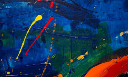
Using Cool and Warm Colors in Art and Photography
Artists have long understood the power of colour in conveying emotion and meaning within their work. The use of cool and warm colours can dramatically alter the viewer’s perception of a piece. For instance, an artwork dominated by cool colours may evoke feelings of serenity or melancholy, while one rich in warm hues might inspire excitement or passion.
This interplay between colour temperature allows artists to communicate complex emotions without relying solely on subject matter. In photography, the choice between cool and warm tones can significantly impact the mood of an image. Photographers often manipulate colour temperature during post-processing to achieve a desired effect.
A photograph taken during the golden hour—when warm sunlight bathes the landscape—can evoke feelings of nostalgia or warmth. Conversely, images captured in cooler light may convey a sense of detachment or calmness. Understanding how to effectively use cool and warm colours in art and photography enables creators to enhance their storytelling capabilities and engage viewers on a deeper emotional level.
Incorporating Cool and Warm Colors in Fashion and Makeup
The fashion industry is another domain where the significance of cool and warm colours cannot be overstated. Designers often select colour palettes based on the emotional responses they wish to elicit from consumers. Cool colours like navy blue or emerald green may be favoured for formal wear due to their sophisticated appeal, while warm colours such as coral or mustard yellow might dominate casual collections for their vibrant energy.
In makeup artistry, understanding the undertones of cool and warm colours is crucial for achieving harmonious looks. For instance, individuals with cool undertones may find that shades like pinks or blues complement their skin tone beautifully, while those with warm undertones might gravitate towards earthy tones like oranges or golds. By incorporating both cool and warm hues into fashion and makeup choices, individuals can express their personalities while enhancing their natural beauty.
Cool and Warm Colors in Marketing and Branding
In the realm of marketing and branding, colour plays a pivotal role in shaping consumer perceptions and behaviours. Brands often utilise cool colours to convey trustworthiness and professionalism; think of banks that favour blue in their logos to instil confidence in their clients. On the other hand, warm colours are frequently employed to evoke feelings of excitement or urgency; fast-food chains often use red and yellow to stimulate appetite and encourage quick decision-making.
The psychological impact of colour extends beyond mere aesthetics; it influences how consumers perceive a brand’s identity and values. By carefully selecting colour palettes that align with their messaging, companies can create strong emotional connections with their target audience. Understanding the implications of cool and warm colours in marketing allows brands to craft compelling narratives that resonate with consumers on a deeper level.
Tips for Using Cool and Warm Colors to Create a Desired Atmosphere
When it comes to utilising cool and warm colours effectively, there are several strategies one can employ to create a desired atmosphere. First and foremost, consider the purpose of the space or project at hand. If you aim to foster relaxation or contemplation, lean towards cooler tones that promote calmness.
Conversely, if you wish to energise or inspire social interaction, incorporate warmer hues that evoke enthusiasm. Another effective approach is to create balance through contrast. Pairing cool colours with warm accents can add depth and interest to any design or artwork.
For instance, a predominantly blue room might benefit from warm-toned cushions or artwork to create visual intrigue without overwhelming the senses. Additionally, consider the lighting conditions; natural light can alter how colours appear in a space, so testing different combinations under various lighting scenarios is advisable. Finally, trust your instincts when working with colour; personal preferences play a significant role in how we perceive colour combinations.
Experimentation is key—don’t hesitate to try out different palettes until you find one that resonates with your vision. By thoughtfully incorporating cool and warm colours into your projects, you can create atmospheres that not only look appealing but also evoke the desired emotional responses from those who experience them. In conclusion, the interplay between cool and warm colours is a powerful tool that transcends various fields—from art to interior design to marketing.
By understanding the psychological impacts and emotional effects these colours have on individuals, one can harness their potential to create meaningful experiences across different contexts. Whether you are an artist seeking to convey emotion through your work or a designer aiming to craft inviting spaces, recognising the significance of colour will undoubtedly enhance your creative endeavours.
When considering the impact of cool and warm colors on mood and atmosphere in art, it is important to also explore the techniques used by artists to convey their message. One such example is the painting “The Burning of the Houses of Parliament” by William Turner. This masterpiece not only showcases the artist’s use of warm and cool colors to evoke different emotions but also demonstrates the technique of impasto, which adds texture and depth to the artwork. To protect outdoor murals like Turner’s painting, weatherproofing and varnishes are essential. To learn more about the fascinating world of art techniques and preservation, check out this article.
FAQs
What are cool and warm colors?
Cool colors are those that give a sense of calmness and relaxation, such as blues, greens, and purples. Warm colors, on the other hand, are those that evoke a sense of warmth and energy, such as reds, oranges, and yellows.
How do cool colors impact mood and atmosphere?
Cool colors are known to have a calming effect on people and can create a sense of tranquility and peacefulness. They are often used in spaces where relaxation and concentration are important, such as bedrooms and offices.
How do warm colors impact mood and atmosphere?
Warm colors are known to create a sense of energy and warmth, and can evoke feelings of excitement and happiness. They are often used in spaces where social interaction and activity are encouraged, such as living rooms and dining areas.
Can cool and warm colors be used together?
Yes, cool and warm colors can be used together to create a balanced and harmonious atmosphere. By combining cool and warm colors, you can create a space that is both calming and energizing, depending on the proportions and placement of the colors.
What are some examples of cool and warm color combinations?
Some examples of cool and warm color combinations include pairing a cool blue with a warm orange, or a cool green with a warm red. These combinations can create a dynamic and visually appealing atmosphere in a space.