Monochromatic colour schemes, characterised by the use of a single hue in varying shades, tints, and tones, possess a unique power that can transform any visual experience. This approach to colour not only simplifies the palette but also creates a sense of harmony and cohesion that is often difficult to achieve with more complex combinations. By focusing on one colour, artists and designers can evoke specific emotions and convey messages with clarity.
The subtle variations within a monochromatic scheme allow for depth and texture, making it an effective tool in both art and design. The beauty of monochromatic colour schemes lies in their ability to create a strong visual impact while maintaining a sense of elegance. For instance, a room painted in varying shades of blue can evoke feelings of calmness and serenity, while a series of red tones can generate energy and passion.
This versatility makes monochromatic palettes particularly appealing in various contexts, from interior design to fashion. By understanding the power of a single colour, creators can harness its potential to communicate effectively and engage their audience on a deeper level.
Summary
- Monochromatic colour schemes can create a powerful and cohesive visual impact in various design fields.
- Exploring the psychology of a single hue can help in understanding its emotional and symbolic associations.
- Creating depth and interest with monochromatic design involves playing with different shades, tints, and tones of the same colour.
- Monochromatic fashion offers versatility and sophistication, allowing for easy coordination and a timeless aesthetic.
- Using monochromatic decor can help in creating a serene and harmonious home environment, promoting a sense of calm and balance.
Exploring the Psychology of a Single Hue
The psychology of colour is a fascinating field that delves into how different hues influence human emotions and behaviours. When it comes to monochromatic schemes, the psychological implications of a single hue can be profound. Each colour carries its own set of associations; for example, blue is often linked to tranquillity and trust, while yellow is associated with happiness and optimism.
By utilising a monochromatic palette, artists and designers can amplify these emotional responses, creating an immersive experience that resonates with viewers. Moreover, the use of a single hue can simplify the decision-making process for both creators and consumers. When faced with an overwhelming array of colours, individuals may struggle to make choices.
A monochromatic scheme eliminates this confusion, allowing for a more focused exploration of the chosen colour’s emotional landscape. This clarity can lead to stronger connections between the artwork or design and its audience, as the viewer is invited to engage with the nuances of the hue without distraction.
How to Create Depth and Interest with Monochromatic Design
Creating depth and interest within a monochromatic design requires a thoughtful approach to the use of shades, tints, and tones. By manipulating these variations, artists can achieve a sense of dimension that draws the viewer’s eye and encourages exploration. For instance, incorporating darker shades can create shadows and depth, while lighter tints can highlight certain areas, adding contrast and visual intrigue.
This interplay between light and dark is essential in maintaining engagement within a seemingly simple palette. Texture also plays a crucial role in enhancing the depth of monochromatic designs. By combining different materials or techniques—such as matte versus glossy finishes or smooth versus rough textures—designers can create a rich visual experience that captivates the audience.
In painting, layering techniques can add complexity to a monochromatic piece, allowing for subtle shifts in tone that invite closer inspection. Ultimately, the key to successful monochromatic design lies in the careful balance of these elements, ensuring that the final composition remains dynamic and engaging.
The Versatility of Monochromatic Fashion
Monochromatic fashion has long been celebrated for its timeless elegance and versatility. Outfits composed of varying shades of a single colour can create a streamlined silhouette that flatters the figure while allowing for personal expression through texture and layering. This approach not only simplifies the process of getting dressed but also opens up endless possibilities for creativity.
A monochromatic ensemble can be dressed up or down depending on the occasion, making it an ideal choice for both casual outings and formal events. Furthermore, monochromatic fashion allows individuals to experiment with different styles without overwhelming their look. By focusing on one colour, wearers can play with various silhouettes, fabrics, and accessories while maintaining a cohesive appearance.
For example, pairing a deep green blouse with lighter green trousers and emerald accessories creates an eye-catching yet harmonious outfit. This versatility extends beyond individual pieces; entire collections built around monochromatic themes can showcase a designer’s vision while appealing to a broad audience.
Using Monochromatic Decor to Create a Serene Home
In interior design, monochromatic decor has gained popularity for its ability to create serene and cohesive living spaces. By employing varying shades of a single colour throughout a room or home, designers can establish a calming atmosphere that promotes relaxation and well-being. Soft neutrals like beige or grey can evoke warmth and comfort, while cooler tones like blue or green can foster tranquillity.
This approach not only enhances the aesthetic appeal of a space but also contributes to its overall mood. To effectively implement monochromatic decor, it is essential to consider the interplay of light and texture within the chosen colour scheme. Natural light can dramatically alter how colours are perceived; therefore, selecting shades that complement the room’s lighting is crucial.
Additionally, incorporating different materials—such as textiles, wood, or metal—can add depth and interest to the space without disrupting the overall harmony. Ultimately, monochromatic decor offers an opportunity to create personalised sanctuaries that reflect individual tastes while promoting peace and serenity.
Monochromatic Makeup: Tips and Tricks for a Polished Look
Monochromatic makeup is an emerging trend that embraces the beauty of using one colour across various elements of the face. This technique not only simplifies the makeup application process but also creates a polished and cohesive look that is both modern and sophisticated. To achieve this effect, one must select a colour that complements their skin tone while allowing for variations in intensity across different areas—such as eyes, lips, and cheeks.
When applying monochromatic makeup, it is essential to consider texture as well as colour. For instance, using a cream blush in the same hue as your lipstick can create a seamless transition between your features. Additionally, incorporating different finishes—such as matte eyeshadow paired with glossy lips—can add dimension to your look without straying from the chosen colour palette.
Ultimately, mastering monochromatic makeup involves experimentation and practice; by finding the right balance between shades and textures, one can achieve an effortlessly chic appearance.
The Impact of Monochromatic Art and Photography
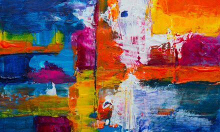
Monochromatic art and photography have long been celebrated for their ability to convey emotion through simplicity. By stripping away the distractions of multiple colours, artists can focus on form, composition, and texture—elements that often take centre stage in monochromatic works. This approach allows viewers to engage more deeply with the subject matter, as they are invited to explore the nuances within a single hue.
In photography, monochromatic images can evoke powerful emotions by highlighting contrasts in light and shadow. Black-and-white photography is perhaps the most well-known example of this technique; it emphasises shapes and textures while creating a timeless quality that transcends trends. Similarly, artists who work within a limited colour palette can evoke specific moods or themes through their choice of hue.
Whether it’s the warmth of sepia tones or the coolness of blue greys, monochromatic art invites contemplation and reflection in ways that multi-coloured works may not.
Incorporating Monochromatic Elements into Graphic Design
In graphic design, incorporating monochromatic elements can enhance visual communication by creating clarity and focus. A well-executed monochromatic design allows for easy navigation while maintaining aesthetic appeal. By utilising varying shades of one colour throughout a project—be it a website, poster, or branding materials—designers can establish a strong visual identity that resonates with their target audience.
Moreover, monochromatic designs lend themselves well to modern aesthetics, often conveying professionalism and sophistication. When combined with clean lines and ample white space, these designs can create an inviting atmosphere that encourages engagement. Additionally, using contrasting shades within a monochromatic scheme can help highlight important information or calls to action without overwhelming the viewer.
Ultimately, incorporating monochromatic elements into graphic design not only enhances visual impact but also reinforces brand messaging through simplicity and coherence. In conclusion, monochromatic colour schemes offer an array of possibilities across various disciplines—from art and fashion to interior design and graphic communication. By understanding the power of a single hue and exploring its psychological implications, creators can craft compelling experiences that resonate deeply with their audiences.
Whether through creating depth in design or embracing simplicity in fashion choices, the versatility of monochromatic palettes continues to inspire innovation and creativity across all artistic fields.
Monochromatic Magic: Variations of a Single Hue explores the beauty and versatility of using a single colour in art. This article delves into the different ways artists can create stunning pieces by focusing on one hue. For more information on art galleries showcasing monochromatic works, check out The Gallery Guide. This resource provides a comprehensive list of galleries where you can admire and purchase monochromatic masterpieces.
FAQs
What is monochromatic magic?
Monochromatic magic refers to the use of variations of a single hue in design, art, fashion, and other creative fields. It involves using different shades, tints, and tones of a single colour to create a cohesive and visually appealing aesthetic.
How is monochromatic magic used in design?
In design, monochromatic magic is used to create a harmonious and sophisticated look. It involves using different shades of a single colour to add depth and interest to a space or a product. This approach can be seen in interior design, graphic design, and product design.
What are some examples of monochromatic magic in art?
Artists often use monochromatic magic to create impactful and emotive pieces. For example, a painter might use different shades of blue to create a calming and serene landscape, or a photographer might use varying tones of red to evoke a sense of passion and intensity in a portrait.
How does monochromatic magic influence fashion?
In fashion, monochromatic magic is used to create elegant and sophisticated looks. Designers often use different shades and tones of a single colour to create monochromatic outfits that are visually striking and cohesive. This approach can be seen on the runway and in everyday street style.
What are the benefits of using monochromatic magic?
Using variations of a single hue can create a sense of unity and harmony in a design or artwork. It can also help to create a visually impactful and cohesive look, and can be a versatile approach that works well in a variety of creative fields.