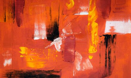
Hue is the foundation of colour theory and serves as the primary descriptor of colour in digital art. It refers to the attribute of a colour that allows it to be classified as red, blue, green, or any other colour on the spectrum. In digital art, understanding hue is crucial because it influences the emotional and aesthetic impact of a piece.
Artists often manipulate hues to evoke specific feelings or to create a particular atmosphere within their work. For instance, warm hues like reds and oranges can generate feelings of warmth and excitement, while cooler hues such as blues and greens tend to evoke calmness and serenity. In digital art, hues can be adjusted using various tools and techniques, allowing artists to experiment with different colour combinations and palettes.
The digital medium offers a unique advantage in this regard, as artists can easily shift hues without the limitations of traditional materials. This flexibility encourages exploration and innovation, enabling artists to create vibrant compositions that might not be possible with physical paints. Understanding the relationships between different hues—such as complementary, analogous, and triadic schemes—can significantly enhance an artist’s ability to create visually compelling works.
Summary
- Understanding hue is essential in digital art as it refers to the basic colour of an object and is crucial for creating a harmonious colour scheme.
- Exploring saturation in digital art involves understanding the intensity or purity of a colour, which can greatly impact the overall mood and visual impact of the artwork.
- Mastering value in digital art is important as it refers to the lightness or darkness of a colour, and can be used to create depth and dimension in the artwork.
- The importance of colour adjustment in digital art cannot be overstated, as it allows artists to fine-tune and enhance the colours in their artwork to achieve the desired effect.
- Techniques for adjusting hue, saturation, and value in digital art include using tools like the colour balance, selective colour, and gradient maps to achieve the desired colour adjustments.
Exploring Saturation in Digital Art
Creating Visual Impact
Highly saturated colours can create striking visuals that capture attention, while desaturated colours often convey subtlety and sophistication. Artists must consider saturation carefully when developing their compositions, as it can dramatically alter the viewer’s perception of the artwork.
Expressive Possibilities
Manipulating saturation in digital art allows for a wide range of expressive possibilities. For example, an artist might choose to saturate certain elements of a composition to draw focus or create a sense of depth. Conversely, desaturating background elements can help foreground subjects stand out more prominently.
Guiding the Viewer’s Eye
This technique is particularly useful in narrative-driven artworks, where the artist aims to guide the viewer’s eye through the story being told. By understanding how saturation interacts with hue and value, artists can create harmonious and dynamic compositions that resonate with their audience.
Mastering Value in Digital Art
Value refers to the lightness or darkness of a colour, independent of its hue or saturation. It is an essential component of colour theory that significantly influences the overall composition and depth of a digital artwork. Mastering value is crucial for artists, as it helps establish contrast, form, and spatial relationships within a piece.
A well-balanced value structure can lead to a more cohesive and visually appealing artwork, while poor value choices can result in flat or confusing images. In digital art, value can be adjusted easily through various tools and techniques. Artists can use layers, blending modes, and opacity settings to manipulate values effectively.
For instance, creating a gradient from light to dark can add dimension and volume to objects, making them appear more three-dimensional. Additionally, understanding how light interacts with surfaces allows artists to create realistic highlights and shadows that enhance the overall realism of their work. By mastering value, artists can elevate their digital creations from mere illustrations to compelling visual narratives.
The Importance of Colour Adjustment in Digital Art
Colour adjustment is a critical aspect of the digital art creation process that can significantly enhance the final outcome of a piece. It involves fine-tuning hue, saturation, and value to achieve the desired aesthetic effect. Effective colour adjustment can transform an artwork from ordinary to extraordinary by ensuring that all elements work harmoniously together.
This process is particularly important in digital art, where colours can appear differently on various screens or when printed. Moreover, colour adjustment allows artists to correct any discrepancies that may arise during the creation process. For instance, an artist may find that certain colours appear too vibrant or dull when viewed on different devices.
By adjusting these colours, they can ensure consistency across various platforms and maintain the integrity of their vision. Additionally, colour adjustment can help artists convey specific emotions or themes more effectively by aligning their colour choices with their intended message. Ultimately, mastering colour adjustment is essential for any digital artist seeking to create impactful and visually stunning works.
Techniques for Adjusting Hue, Saturation, and Value in Digital Art
There are several techniques that artists can employ to adjust hue, saturation, and value effectively in their digital artworks. One common method is using adjustment layers in software like Adobe Photoshop or Procreate. These layers allow artists to make non-destructive changes to their artwork, enabling them to experiment freely without permanently altering their original image.
For instance, an artist might use a Hue/Saturation adjustment layer to shift the colours in their composition while preserving the underlying details. Another effective technique is employing blending modes to manipulate how colours interact with one another. By changing the blending mode of a layer, artists can create unique effects that enhance the overall composition.
For example, using the “Multiply” blending mode can darken colours while maintaining their saturation, while “Screen” can lighten colours without losing vibrancy. Additionally, artists can utilise gradient maps to create smooth transitions between different values and hues, allowing for more complex colour adjustments that add depth and interest to their work.
Tools and Software for Colour Adjustment in Digital Art
Desktop Software Options
Programmes such as Adobe Photoshop and Corel Painter offer extensive features for manipulating hue, saturation, and value with precision. These applications provide artists with a variety of adjustment layers, filters, and brushes that facilitate seamless colour adjustments throughout the creative process.
Mobile Applications for Artists on the Move
In addition to traditional software options, there are also numerous mobile applications available for artists on-the-go. Apps such as Procreate and Affinity Designer offer robust colour adjustment tools that allow users to make quick changes directly on their tablets or smartphones. Furthermore, many of these applications include built-in colour palettes and swatches that help artists select harmonious colour combinations effortlessly.
Enhancing Workflow and Achieving Stunning Results
By leveraging these tools effectively, artists can enhance their workflow and achieve stunning results in their digital artworks.
Common Mistakes to Avoid in Colour Adjustment in Digital Art
While colour adjustment is an essential skill for digital artists, there are common pitfalls that one should be aware of when manipulating hue, saturation, and value. One frequent mistake is over-saturation; while vibrant colours can be eye-catching, excessive saturation can lead to visual chaos and detract from the overall composition. Artists should strive for balance by ensuring that saturated colours are used purposefully within their work.
Another common error is neglecting value relationships when adjusting colours. Focusing solely on hue or saturation without considering how these adjustments affect the overall value structure can result in flat or uninteresting images. Artists should always keep an eye on how changes in hue or saturation impact the lightness or darkness of their colours.
By maintaining a strong understanding of value relationships throughout the colour adjustment process, artists can create more dynamic and engaging compositions.
Tips for Achieving the Perfect Colour Balance in Digital Art
Achieving perfect colour balance in digital art requires practice and an understanding of fundamental principles. One effective tip is to start with a limited colour palette; this approach encourages artists to focus on harmony rather than overwhelming viewers with too many competing colours. By selecting a few key hues and exploring their variations through saturation and value adjustments, artists can create cohesive compositions that resonate with their audience.
Additionally, regularly stepping back from the artwork during the creation process can provide valuable perspective on colour balance. Viewing the piece from a distance allows artists to assess how well the colours work together as a whole rather than getting lost in minute details. Furthermore, seeking feedback from peers or mentors can offer fresh insights into colour choices that may not have been considered initially.
Ultimately, achieving perfect colour balance is an ongoing journey that requires experimentation, reflection, and a willingness to learn from both successes and mistakes. In conclusion, mastering hue, saturation, value, and colour adjustment techniques is essential for any digital artist seeking to create impactful works. By understanding these fundamental concepts and employing effective tools and strategies, artists can elevate their creations to new heights while avoiding common pitfalls along the way.
With practice and dedication, anyone can develop their skills in colour manipulation and achieve stunning results in their digital art endeavours.
If you are interested in exploring the use of colour in art, you may also enjoy reading about Nicolas Poussin’s painting “The Adoration of the Golden Calf” from 1635. This article provides an introduction to the masterpiece and delves into the artist’s use of colour to convey emotion and meaning. You can find more information about this fascinating artwork here.
FAQs
What is color adjustment in digital art?
Color adjustment in digital art refers to the process of altering the hue, saturation, and value of colors in an image using digital editing software. This allows artists to manipulate and enhance the colors in their artwork to achieve a desired effect.
What is hue, saturation, and value?
Hue refers to the actual color of an object, such as red, blue, or green. Saturation refers to the intensity or purity of a color, with highly saturated colors appearing vivid and intense, while desaturated colors appear more muted. Value refers to the lightness or darkness of a color, with higher values representing lighter colors and lower values representing darker colors.
Why is color adjustment important in digital art?
Color adjustment is important in digital art as it allows artists to fine-tune the colors in their artwork to achieve a specific mood, atmosphere, or visual impact. It also enables artists to correct any color inaccuracies in their original images and to create a cohesive color scheme throughout their artwork.
What are some common tools for color adjustment in digital art software?
Common tools for color adjustment in digital art software include hue/saturation sliders, color balance adjustments, levels and curves adjustments, and selective color adjustments. These tools allow artists to precisely control the hue, saturation, and value of individual colors within their artwork.
How does color adjustment impact the overall quality of digital art?
Effective color adjustment can greatly enhance the overall quality of digital art by improving the visual impact and cohesiveness of the colors within the artwork. It can also help to create a more professional and polished final result. Conversely, poor color adjustment can detract from the overall quality of the artwork and may result in a less impactful or visually appealing piece.