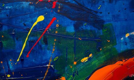
At its core, colour mixing is a fundamental aspect of art and design that allows creators to produce a vast array of hues and shades. The process involves combining different colours to create new ones, and it can be approached in various ways depending on the medium used. In traditional art forms, such as painting, colour mixing typically occurs through the blending of pigments.
This method relies on the subtractive colour model, where colours are created by absorbing certain wavelengths of light while reflecting others. For instance, when blue and yellow pigments are mixed, the resulting green is formed because the blue pigment absorbs red and green light, while the yellow absorbs blue and reflects red and green. In contrast, colour mixing in digital design and photography often employs the additive colour model.
This approach is based on the principle that colours are created by combining different wavelengths of light. When red, green, and blue light are mixed together in varying intensities, they can produce a wide spectrum of colours. Understanding these two distinct methods of colour mixing is essential for artists and designers alike, as it influences their choices in both traditional and digital mediums.
By grasping the basics of colour mixing, one can unlock a world of creative possibilities, allowing for more nuanced and expressive works.
Summary
- Understanding the basics of color mixing is essential for creating harmonious and visually appealing artwork and designs.
- Pigments play a crucial role in color mixing, as they are the substances that give paint its color and opacity.
- Light also plays a significant role in color mixing, as it can affect the way we perceive and mix colors.
- There are differences between pigment mixing and light mixing, and understanding these differences is important for achieving the desired results in art and design.
- Pigment mixing affects art and design by influencing the final appearance and impact of the artwork, while light mixing affects photography and digital design by influencing the way colors are captured and displayed.
The Role of Pigments in Color Mixing
Properties of Pigments
The choice of pigment significantly affects the final outcome of a piece, as each pigment has unique properties that influence its opacity, tinting strength, and lightfastness. For example, cadmium red is known for its vibrant hue and excellent lightfastness, making it a popular choice among artists who seek longevity in their work.
Mixing Pigments
When mixing pigments, artists must consider not only the colours they wish to create but also how different pigments interact with one another. Some pigments can produce unexpected results when combined; for instance, mixing complementary colours may yield muted or neutral tones rather than vibrant ones.
The Role of Medium
Additionally, the medium in which pigments are suspended—be it oil, acrylic, or watercolour—can also affect the mixing process. Understanding these nuances allows artists to make informed decisions about their colour palette, ultimately enhancing their ability to convey emotion and meaning through their work.
The Role of Light in Color Mixing
Light plays a pivotal role in how we perceive colour, influencing both the mixing process and the final appearance of artworks. In the additive colour model, light itself is the medium through which colours are created. When different wavelengths of light are combined, they create new colours based on the principle of additive mixing.
For example, when red and green lights are combined, they produce yellow light. This phenomenon is particularly relevant in digital design and photography, where screens emit light to display colours. Moreover, the quality and intensity of light can dramatically alter our perception of colour.
Natural daylight, artificial lighting, and even the time of day can affect how colours appear to the human eye. Artists must be mindful of these factors when creating their works, as the same colour may look entirely different under varying lighting conditions. This understanding not only enhances an artist’s ability to mix colours effectively but also informs their choices regarding composition and presentation.
Differences between Pigment Mixing and Light Mixing
The distinction between pigment mixing and light mixing is crucial for artists and designers to comprehend fully. Pigment mixing operates on a subtractive model; when pigments are combined, they absorb certain wavelengths of light while reflecting others. This means that the more pigments you mix together, the darker and more muted the resulting colour tends to become.
For instance, mixing multiple pigments can lead to a muddy or dull appearance if not done thoughtfully. Conversely, light mixing follows an additive model where colours are created by combining different wavelengths of light. In this scenario, adding more light sources typically results in brighter and more vibrant colours.
For example, when red and blue lights are mixed together, they produce magenta—a vivid hue that would not be achievable through pigment mixing alone. Understanding these fundamental differences allows artists to choose the appropriate method for their intended outcome, whether they are working with physical materials or digital platforms.
How Pigment Mixing Affects Art and Design
The impact of pigment mixing on art and design cannot be overstated; it is a skill that can elevate an artist’s work from ordinary to extraordinary. Mastery over colour mixing enables artists to create depth, mood, and atmosphere within their pieces. For instance, an artist may choose to mix warm tones to evoke feelings of comfort or use cooler shades to convey a sense of calmness or melancholy.
The ability to manipulate colour through mixing allows for greater emotional expression and storytelling within visual art. Furthermore, pigment mixing plays a significant role in establishing harmony within a composition. Artists often employ colour theory principles—such as complementary or analogous colour schemes—to create balance and visual interest in their work.
By understanding how different pigments interact with one another, artists can develop a cohesive palette that enhances their overall message. This knowledge is equally valuable in design fields such as graphic design or interior design, where colour choices can influence user experience and perception.
How Light Mixing Affects Photography and Digital Design
In photography and digital design, understanding light mixing is essential for achieving accurate colour representation and creating visually striking images. Photographers rely on natural or artificial light sources to capture images that reflect true-to-life colours. The interplay between light and shadow can dramatically alter the mood of a photograph; for instance, soft diffused lighting may create a dreamy atmosphere, while harsh direct light can produce stark contrasts that evoke drama.
Digital designers also harness the principles of light mixing to create vibrant visuals on screens. By manipulating RGB values—red, green, and blue—designers can achieve precise colour combinations that resonate with viewers. This understanding is particularly important in web design and digital marketing, where colour choices can significantly impact user engagement and brand perception.
By mastering light mixing techniques, photographers and digital designers can enhance their work’s aesthetic appeal while ensuring that their intended message is effectively communicated.
The Importance of Colour Theory in Pigment and Light Mixing
Colour theory serves as a foundational framework for understanding both pigment and light mixing. It encompasses various principles that guide artists and designers in their exploration of colour relationships and combinations. One key aspect of colour theory is the colour wheel—a visual representation that illustrates how primary colours (red, blue, yellow) can be mixed to create secondary colours (green, orange, purple) and beyond.
This tool aids artists in selecting harmonious colour schemes that enhance their compositions. Moreover, colour theory delves into concepts such as warm versus cool colours, complementary colours, and analogous colours—all of which play a vital role in both pigment and light mixing. By applying these principles thoughtfully, artists can evoke specific emotions or reactions from their audience.
For instance, complementary colours placed side by side can create visual tension and vibrancy, while analogous colours can produce a sense of harmony and unity within a piece. A solid grasp of colour theory empowers creators to make informed decisions about their work’s aesthetic impact.
Tips for Effective Color Mixing with Pigments and Light
To achieve effective colour mixing with both pigments and light, artists and designers can employ several practical tips that enhance their skills. Firstly, experimentation is key; artists should not shy away from testing various combinations to discover unique hues that resonate with their vision. Keeping a colour journal or swatch book can be beneficial for documenting successful mixes as well as those that did not yield desired results.
Additionally, understanding the properties of individual pigments is crucial for effective mixing. Artists should familiarise themselves with each pigment’s transparency, tinting strength, and undertones to predict how they will interact with one another. Similarly, digital designers should experiment with different RGB values to see how slight adjustments can lead to significant changes in appearance.
Lastly, always consider the context in which your work will be viewed—whether it be under natural light or artificial lighting conditions—as this can greatly influence how colours are perceived. By remaining mindful of these factors and continuously honing their skills through practice and exploration, artists and designers can master the art of colour mixing in both traditional and digital realms. In conclusion, understanding the intricacies of colour mixing—whether through pigments or light—is essential for any artist or designer seeking to elevate their work.
By grasping the fundamental principles behind these processes and applying them thoughtfully within their practice, creators can unlock new dimensions of expression and communication through colour.
If you are interested in learning more about art and its history, you may want to check out the article