Colour theory serves as the foundation for any artist seeking to master the art of oil painting. At its core, colour theory encompasses the relationships between colours, how they interact, and the emotional responses they evoke. The colour wheel, a fundamental tool in this theory, illustrates the primary colours—red, blue, and yellow—alongside secondary colours, which are created by mixing these primaries.
For instance, combining red and blue yields purple, while yellow and blue create green. This wheel not only aids in understanding colour relationships but also provides a visual guide for artists to explore various combinations and contrasts. In addition to the colour wheel, artists must also consider the concepts of warm and cool colours.
Warm colours, such as reds, oranges, and yellows, tend to evoke feelings of warmth and energy, while cool colours like blues, greens, and purples often convey calmness and serenity. Understanding these distinctions allows artists to manipulate emotions within their work effectively. Furthermore, the use of tints (adding white), shades (adding black), and tones (adding grey) can alter the intensity and mood of a colour, providing artists with an expansive palette to express their vision.
Mastery of these basic principles is essential for any oil painter aiming to create compelling and emotionally resonant artwork.
Summary
- Understanding the basics of color theory is essential for oil painting
- Exploring the psychology of color harmony can enhance the impact of artwork
- Choosing the right color palette is crucial for creating vibrant oil paintings
- Techniques for mixing and blending colors are important skills for oil painters
- Creating depth and dimension with color harmony can elevate oil artwork
Exploring the Psychology of Color Harmony in Artwork
The psychology of colour harmony delves into how colours interact and influence human perception and emotion. When artists create harmonious colour schemes, they tap into a psychological response that can enhance the viewer’s experience. For instance, analogous colours—those that sit next to each other on the colour wheel—tend to create a sense of unity and tranquillity.
This is particularly effective in landscapes or serene scenes where a cohesive atmosphere is desired. Conversely, using complementary colours—those opposite each other on the wheel—can generate tension and excitement, drawing attention to specific elements within a composition. Moreover, colour harmony can significantly impact the narrative of a painting.
A piece dominated by cool colours may evoke feelings of melancholy or introspection, while one rich in warm hues might inspire joy or passion. Artists can leverage this psychological aspect by thoughtfully selecting their colour palettes to align with the intended message of their work. By understanding how different colours resonate with viewers on an emotional level, artists can create more profound connections through their art, making it not just visually appealing but also psychologically engaging.
Choosing the Right Color Palette for Vibrant Oil Paintings
Selecting an appropriate colour palette is crucial for achieving vibrancy in oil paintings. A well-chosen palette can breathe life into a piece, making it visually striking and memorable. Artists often begin by considering the mood they wish to convey; for instance, a vibrant sunset might call for a palette rich in oranges, pinks, and purples, while a tranquil forest scene may benefit from various greens and earthy tones.
The key is to strike a balance between boldness and subtlety, ensuring that the chosen colours complement rather than clash. One effective approach is to limit the palette to a few key colours while incorporating variations in tone and saturation. This technique not only simplifies the mixing process but also fosters a sense of cohesion throughout the artwork.
Additionally, artists can experiment with colour temperature by including both warm and cool hues within their palette. This interplay can create dynamic contrasts that enhance vibrancy and depth. Ultimately, the right colour palette serves as a powerful tool for artists to express their vision while captivating their audience.
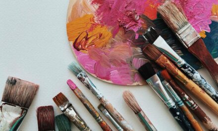
Techniques for Mixing and Blending Colors in Oil Painting
Mixing and blending colours in oil painting is an art form in itself, requiring both skill and intuition. One fundamental technique involves using a palette knife or brush to combine colours directly on the palette before applying them to the canvas. This method allows artists to experiment with various ratios until they achieve the desired hue.
It is essential to remember that oil paints have a slow drying time, which provides ample opportunity for blending on the canvas as well. Artists can layer colours gradually, allowing them to merge seamlessly into one another. Another effective technique is glazing, where thin layers of transparent paint are applied over dried layers.
This method not only enhances depth but also allows underlying colours to influence the final appearance of the top layer. By carefully selecting transparent pigments, artists can create luminous effects that add vibrancy to their work. Additionally, scumbling—a technique involving applying a thin layer of opaque paint over a dry layer—can introduce texture and complexity to colour interactions.
Mastering these techniques enables artists to manipulate colour with precision, resulting in rich and dynamic oil paintings.
Creating Depth and Dimension with Color Harmony in Oil Artwork
Creating depth and dimension in oil paintings is intricately linked to colour harmony. Artists can achieve this effect by employing techniques such as atmospheric perspective, where colours become lighter and less saturated as they recede into the background. This principle mimics how we perceive distant objects in nature, allowing artists to create a sense of space within their compositions.
By using cooler tones for background elements and warmer hues for foreground subjects, artists can enhance the three-dimensionality of their work. Moreover, layering colours strategically can contribute significantly to depth. By building up layers of paint with varying degrees of transparency and opacity, artists can create a rich tapestry of colour that draws viewers into the artwork.
Shadows play a crucial role in this process; using darker shades or complementary colours can add dimension and contrast to lighter areas. Ultimately, achieving depth through colour harmony not only enhances the visual appeal of an oil painting but also invites viewers to engage more deeply with the narrative being presented.
Using Contrast and Complementary Colors to Enhance Vibrancy
Contrast is a powerful tool in oil painting that can dramatically enhance vibrancy and visual interest. Complementary colours—those located opposite each other on the colour wheel—create striking contrasts that can make elements within a painting pop. For example, pairing vibrant oranges with deep blues can produce an electrifying effect that draws attention to specific areas of the canvas.
This technique is particularly effective when highlighting focal points or creating dynamic compositions that capture the viewer’s eye. In addition to using complementary colours, artists can also explore contrast through variations in value and saturation. A bright yellow against a deep purple not only creates visual tension but also adds depth to the overall composition.
By carefully balancing these contrasting elements, artists can guide viewers’ attention throughout the painting while maintaining harmony within the piece. Ultimately, mastering contrast allows artists to elevate their work from mere representation to vibrant expressions of emotion and narrative.
Incorporating Colour Harmony into Different Subjects and Styles of Oil Painting
Colour harmony is not confined to any single subject or style; rather, it is a versatile principle that can be adapted across various genres of oil painting. In portraiture, for instance, artists often utilise harmonious skin tones alongside complementary backgrounds to create striking contrasts that highlight facial features. The careful selection of colours can evoke specific emotions or character traits within the subject, enhancing the overall narrative of the piece.
Similarly, in landscape painting, colour harmony plays a vital role in conveying mood and atmosphere. Artists may choose analogous colours for serene scenes or employ bold contrasts for dramatic effects during sunset or stormy weather. Abstract painters also benefit from understanding colour harmony; by experimenting with non-representational forms and vibrant palettes, they can evoke emotions purely through colour relationships.
Regardless of style or subject matter, incorporating colour harmony enriches an artist’s ability to communicate effectively with their audience.
Tips for Achieving a Harmonious and Vibrant Composition in Oil Artwork
Achieving a harmonious and vibrant composition in oil artwork requires careful planning and consideration of various elements. One effective tip is to create a colour sketch or study before diving into the final piece. This preliminary step allows artists to experiment with different palettes and compositions without committing to paint on canvas immediately.
By visualising how colours interact within the context of their subject matter, artists can make informed decisions that enhance overall harmony. Another valuable tip is to step back frequently during the painting process. This practice enables artists to assess their work from a distance, allowing them to identify areas that may require adjustment in terms of colour balance or composition.
Additionally, seeking feedback from fellow artists or mentors can provide fresh perspectives on achieving vibrancy and harmony within a piece. Ultimately, patience and experimentation are key; by embracing these principles, artists can cultivate their unique voice while creating captivating oil paintings that resonate with viewers on multiple levels. In conclusion, mastering colour theory and its application in oil painting is an ongoing journey for any artist dedicated to their craft.
By understanding the basics of colour relationships, exploring psychological impacts, choosing appropriate palettes, employing mixing techniques, creating depth through harmony, utilising contrast effectively, adapting principles across subjects and styles, and implementing practical tips for composition—artists can elevate their work into realms of vibrancy and emotional resonance that captivate audiences far beyond mere visual appeal.
For those interested in exploring different art techniques, an interesting article to read is An Introduction to the Art Technique: Woodblock Printing (Moku Hanga). This article delves into the traditional Japanese method of woodblock printing, providing insights into the history and process of this unique art form. Understanding different art techniques can not only broaden your artistic knowledge but also inspire new ideas for your own artwork. Mastering Color Harmony in Oil for Vibrant Artwork can be complemented by learning about various art techniques to enhance your creative skills.
