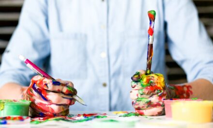
In the realm of art, the concept of neutrals is often misunderstood or overlooked. Neutrals are not merely the absence of colour; rather, they are complex entities that can significantly influence the overall composition of a piece. Tones, shades, and tints are essential components of this category.
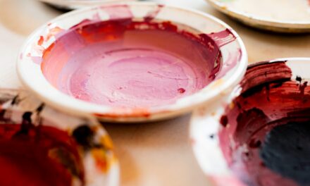
A tone is created by adding grey to a pure colour, which alters its intensity without changing its hue. This modification allows artists to achieve a more subdued and sophisticated palette, perfect for conveying subtle emotions or creating atmospheric effects. Shades, on the other hand, are produced by incorporating black into a colour, resulting in a darker version of the original hue.
This technique can add depth and drama to a work, allowing for striking contrasts that draw the viewer’s eye. Tints are formed by mixing white with a colour, resulting in a lighter version that can evoke feelings of airiness and lightness. Together, these three elements—tones, shades, and tints—form the backbone of a neutral palette, providing artists with a versatile toolkit for expression.
Summary
- Neutrals in art refer to tones, shades, and tints that are not associated with any specific colour.
- Neutrals can complement and enhance any colour palette, adding balance and sophistication to the artwork.
- Using neutrals in art can create depth and dimension, adding a sense of realism and complexity to the composition.
- Neutrals have a psychological impact, evoking emotions and moods such as calmness, elegance, and timelessness.
- Neutrals can be incorporated in various art forms such as painting, drawing, and sculpture, adding versatility and interest to the artwork.
The Versatility of Neutrals: How They Can Enhance Any Colour Palette
Neutrals possess an extraordinary versatility that can enhance any colour palette, regardless of the artistic style or medium employed. When used effectively, neutrals can serve as a bridge between vibrant colours, allowing them to coexist harmoniously within a composition. For instance, a bright red can be tempered with a soft grey, creating a balanced visual experience that prevents the colours from clashing.
This ability to harmonise contrasting hues is one of the reasons why neutrals are so highly valued in art. Moreover, neutrals can also act as a grounding force within a piece. They provide visual rest for the viewer’s eye amidst more vibrant colours, allowing for a more engaging and dynamic composition.
By strategically placing neutrals within a work, artists can guide the viewer’s gaze and create focal points that draw attention to specific areas. This interplay between neutrals and colours not only enhances the aesthetic appeal of a piece but also contributes to its overall narrative and emotional impact.
Using Neutrals to Create Depth and Dimension in Art
The use of neutrals is instrumental in creating depth and dimension within an artwork. By employing shades and tones effectively, artists can simulate three-dimensionality on a two-dimensional surface. For example, when painting landscapes, an artist might use darker shades in the foreground to suggest proximity while employing lighter tones in the background to create an illusion of distance.
This technique not only adds realism but also invites viewers to explore the spatial relationships within the artwork. Additionally, neutrals can be used to create texture and form. In sculpture, for instance, artists often utilise neutral materials such as clay or stone to highlight the intricacies of their work.
The subtle variations in colour and texture found in these materials can enhance the tactile quality of a sculpture, inviting viewers to engage with it on a sensory level. By incorporating neutrals thoughtfully, artists can elevate their work from mere representation to an immersive experience that captivates the audience.
The Psychological Impact of Neutrals: How They Evoke Emotions and Moods
Neutrals possess a unique psychological impact that can evoke a wide range of emotions and moods in viewers. The subtlety of these colours often allows them to convey feelings that are more nuanced than those expressed by bold hues. For instance, soft greys and beiges can evoke feelings of calmness and serenity, making them ideal choices for artworks intended to promote relaxation or introspection.
In contrast, darker neutrals like charcoal or deep browns can elicit feelings of melancholy or contemplation. Furthermore, the emotional resonance of neutrals can vary depending on cultural context and personal experiences. In some cultures, certain neutral tones may be associated with mourning or loss, while in others, they may signify purity or simplicity.
This complexity adds another layer of depth to an artist’s work, as they must consider not only their own intentions but also how their use of neutrals may be interpreted by diverse audiences. By harnessing the psychological power of neutrals, artists can create works that resonate on both personal and universal levels.
Incorporating Neutrals in Different Art Forms: Painting, Drawing, and Sculpture
The incorporation of neutrals is not limited to any single art form; rather, it spans across various mediums including painting, drawing, and sculpture. In painting, artists often use neutrals as a foundation upon which to build their compositions. A well-balanced palette that includes neutrals allows for greater flexibility in layering colours and achieving desired effects.
For example, an artist might begin with a neutral base layer before adding vibrant colours on top, creating depth and richness in their work. In drawing, neutrals play an equally important role. Artists frequently utilise graphite or charcoal—both inherently neutral materials—to create shading and texture.
These mediums allow for subtle gradations that can enhance the realism of a drawing or lend it an abstract quality. Similarly, in sculpture, neutral materials such as marble or clay provide artists with the opportunity to explore form and texture without the distraction of colour. The inherent qualities of these materials can evoke different emotions and responses from viewers, making them powerful tools in an artist’s arsenal.
Exploring the Subtleties of Neutrals: The Intriguing Effects of Mixing Tones, Shades, and Tints
The exploration of neutrals opens up a world of possibilities for artists willing to experiment with mixing tones, shades, and tints. The subtle variations that arise from these combinations can lead to unexpected results that enrich an artwork’s narrative and visual complexity. For instance, an artist might mix various shades of grey with hints of colour to create a unique atmosphere that reflects their emotional state or thematic intent.
Moreover, the process of mixing these elements encourages artists to develop their own distinctive voice. By understanding how different combinations interact with one another, they can create signature palettes that resonate with their personal style. This exploration not only enhances technical skills but also fosters creativity and innovation within an artist’s practice.
As they delve deeper into the subtleties of neutrals, artists may discover new ways to express their ideas and emotions through their work.
Neutrals in Art History: Their Significance and Evolution in Different Periods
Throughout art history, neutrals have played a significant role in various movements and styles. In the Renaissance period, for example, artists such as Leonardo da Vinci employed neutral tones to achieve realistic skin tones and atmospheric perspectives in their paintings. The careful blending of shades allowed for lifelike representations that captivated audiences and set new standards for artistic excellence.
As art movements evolved over time, so too did the use of neutrals. In the Impressionist movement, artists like Claude Monet began to experiment with lighter tints and softer tones to capture fleeting moments of light and colour in nature. This shift marked a departure from traditional techniques and opened up new avenues for artistic expression.
In contemporary art, neutrals continue to hold significance as artists explore minimalism and abstraction, using these colours to challenge perceptions and provoke thought.
Experimenting with Neutrals: Pushing the Boundaries of Traditional Colour Theory in Art
The experimentation with neutrals offers artists an opportunity to push the boundaries of traditional colour theory and redefine their creative practices. By stepping outside conventional norms and embracing the complexities of neutral palettes, artists can challenge preconceived notions about colour and its role in art. This willingness to experiment can lead to innovative techniques that expand the possibilities for expression.
For instance, some contemporary artists have begun to incorporate unconventional materials into their work—such as found objects or mixed media—that introduce new neutral tones into their compositions. This approach not only enriches their visual language but also invites viewers to reconsider their relationship with colour in art. As artists continue to explore the nuances of neutrals, they contribute to an ongoing dialogue about creativity and expression that transcends traditional boundaries.
In conclusion, neutrals are far more than mere background elements; they are vital components that enrich artistic expression across various mediums and styles. By understanding their significance—ranging from their technical applications to their psychological impacts—artists can harness the power of neutrals to create compelling works that resonate deeply with audiences. As we continue to explore this fascinating aspect of art, we uncover new dimensions of creativity that inspire both artists and viewers alike.
In addition to exploring The Power of Neutrals: Tones, Shades, and Tints in Art, readers may also find interest in the article