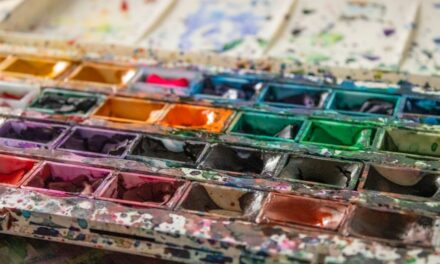
Colour is a fundamental aspect of visual art, serving as a powerful tool for expression and communication. However, the way colour is represented can vary significantly across different artistic mediums. Each medium has its own unique properties that influence how colours are perceived and rendered.
For instance, the transparency of watercolours allows for a luminosity that can create ethereal effects, while the opacity of acrylics can produce vibrant, solid hues. Oil paints, on the other hand, offer a rich depth and a slow drying time that allows for intricate blending and layering. Understanding these differences is crucial for artists who wish to translate their vision accurately across various mediums.
Moreover, the colour theory itself plays a pivotal role in how colours interact within each medium. The way pigments mix, the surface texture of the canvas or paper, and even the lighting conditions can alter the appearance of colour. For example, in acrylic painting, colours can appear darker when dry than when wet due to their inherent properties.
In contrast, oil paints maintain their vibrancy and richness even after drying. This understanding of colour representation is essential for artists to achieve their desired outcomes and to navigate the complexities of translating colour from one medium to another.
Summary
- Colour representation varies across different mediums due to differences in pigment, opacity, and texture.
- Acrylic medium allows for vibrant and bold colour translation, with the ability to layer and mix colours for desired effects.
- Oil medium offers rich and deep colour translation, with the flexibility to blend and manipulate colours for a smooth finish.
- Pastel medium provides a soft and delicate colour translation, with the ability to create subtle gradients and textures.
- Techniques such as colour mixing, layering, and using a limited palette can help achieve colour consistency across different mediums.
Translating Colour in Acrylic Medium
Acrylic paints are known for their versatility and quick drying time, making them a popular choice among contemporary artists. When translating colour in acrylics, it is essential to consider the medium’s unique characteristics. Acrylics can be thinned with water or mixed with various mediums to alter their texture and finish, allowing for a wide range of effects.
This adaptability means that artists can achieve everything from transparent washes to thick impasto applications. However, the challenge lies in maintaining colour consistency throughout the painting process, as acrylics can dry darker than they appear when wet. To effectively translate colour in acrylics, artists often employ a systematic approach to mixing.
By creating a colour chart or swatch book, they can document their mixtures and ensure that they can replicate specific hues later on. Additionally, understanding the colour wheel and complementary colours can aid in achieving balance and harmony within a composition. The use of glazing techniques—applying thin layers of transparent colour over dried layers—can also enhance depth and luminosity, allowing artists to explore the full potential of acrylics while maintaining control over their colour palette.
Translating Colour in Oil Medium
Oil paints have long been revered for their rich texture and depth of colour. Translating colour in oils requires an understanding of the medium’s slow drying time, which allows for extensive blending and layering techniques. This characteristic enables artists to create subtle transitions between colours and achieve a level of realism that is often sought after in portraiture and landscape painting.
The ability to work wet-on-wet or wet-on-dry provides artists with flexibility in their approach, allowing them to manipulate colours until they achieve the desired effect. One of the key aspects of working with oil paints is the use of a limited palette. Many artists find that restricting their colour choices leads to more cohesive works, as it encourages them to explore the nuances of each hue.
By mixing colours directly on the palette or canvas, artists can create a wide range of tones and shades that reflect their vision. Additionally, understanding the concept of undertones—how a colour can shift based on its surrounding hues—can greatly enhance an artist’s ability to translate colour effectively in oil painting.
Translating Colour in Pastel Medium
Pastels offer a unique approach to colour representation, combining the vibrancy of pigment with the immediacy of drawing. Translating colour in pastels involves an understanding of both soft and hard pastels, as well as their application techniques. Soft pastels are known for their intense pigmentation and blendability, allowing artists to create smooth transitions and rich textures.
In contrast, hard pastels provide more control for fine details and line work. The tactile nature of pastels invites artists to experiment with layering and blending directly on the paper, resulting in a dynamic interplay of colours. When working with pastels, it is essential to consider the surface on which they are applied.
Different papers can affect how colours appear; for instance, textured papers can hold more pigment and create a more vibrant finish, while smoother surfaces may yield softer results. Artists often use fixatives to preserve their work, but this can alter the appearance of colours as well. Therefore, testing different combinations of pastels and surfaces is crucial for achieving the desired outcome.
Embracing the unique qualities of pastels allows artists to explore a wide spectrum of colour possibilities while developing their individual style.
Techniques for Achieving Colour Consistency Across Mediums
Achieving colour consistency across different mediums requires a thoughtful approach to mixing and application techniques. One effective method is to create a comprehensive colour chart that includes swatches from each medium being used. This chart serves as a reference point for artists, enabling them to compare colours side by side and make informed decisions about their palettes.
Additionally, maintaining a consistent lighting environment while working can help ensure that colours are perceived accurately across mediums. Another technique involves using a limited palette across all mediums. By selecting a core set of colours that work well together, artists can develop a cohesive body of work that maintains a consistent aesthetic.
This practice not only simplifies the mixing process but also encourages artists to explore the full potential of each hue within different contexts. Furthermore, understanding how colours interact with one another—through concepts such as complementary colours or analogous schemes—can aid in achieving harmony across various mediums.
Challenges in Translating Colour Across Mediums
Despite an artist’s best efforts, translating colour across different mediums can present numerous challenges. One significant issue is the inherent differences in pigment properties between mediums. For example, certain pigments may appear vibrant in oil but lose their intensity when translated into acrylic or pastel formats.
This discrepancy can lead to frustration when attempting to replicate specific hues or effects from one medium to another. Additionally, factors such as drying times and application techniques can further complicate colour translation. The quick-drying nature of acrylics may not allow for the same blending opportunities as oils, while pastels require a different approach altogether due to their dry application method.
Artists must be adaptable and willing to experiment with each medium’s unique characteristics to overcome these challenges effectively.
Tips for Translating Colour Across Mediums
To navigate the complexities of translating colour across various mediums successfully, artists can employ several practical tips. First and foremost, keeping a detailed sketchbook or journal documenting colour mixtures and techniques can be invaluable. This record allows artists to refer back to successful combinations and replicate them in future works.
Another helpful strategy is to engage in regular practice across different mediums. By dedicating time to experiment with colour mixing and application techniques in each medium, artists can develop a deeper understanding of how colours behave differently. This hands-on experience fosters confidence when transitioning between mediums and enhances overall artistic versatility.
Lastly, seeking feedback from peers or mentors can provide fresh perspectives on colour translation challenges. Constructive criticism can help identify areas for improvement and inspire new approaches to achieving desired outcomes.
Embracing the Unique Qualities of Each Medium
In conclusion, translating colour across various artistic mediums is both an exciting challenge and an opportunity for growth as an artist. Each medium possesses its own unique qualities that influence how colours are represented and perceived. By understanding these differences and employing effective techniques for mixing and application, artists can navigate the complexities of colour translation with greater ease.
Ultimately, embracing the distinct characteristics of each medium allows artists to expand their creative horizons and develop a more nuanced understanding of colour itself. Whether working with acrylics, oils, or pastels, the journey of exploring colour is an integral part of artistic expression that enriches both the artist’s practice and the viewer’s experience. As artists continue to experiment and innovate within these mediums, they contribute to the ever-evolving dialogue surrounding colour in art—a dialogue that celebrates diversity, creativity, and individual expression.
If you are interested in exploring different art techniques, you may enjoy reading An Introduction to the Art Technique: Paper Craft. This article delves into the intricate world of creating art using paper as the primary medium. It provides insights into the various methods and tools used in paper crafting, offering a unique perspective on the creative process. Just like Translating Color Across Mediums: Acrylic, Oil, Pastels, this article showcases the versatility and beauty of different artistic mediums.
FAQs
What are the different mediums used for translating color in art?
The different mediums used for translating color in art include acrylic paint, oil paint, and pastels. Each medium has its own unique properties and techniques for achieving vibrant and expressive colors.
What are the characteristics of acrylic paint for translating color?
Acrylic paint is known for its fast drying time, versatility, and ability to create bold and vibrant colors. It can be thinned with water for transparent effects or layered for opaque and textured finishes.
What are the characteristics of oil paint for translating color?
Oil paint is known for its rich and luminous colors, slow drying time, and ability to blend and layer smoothly. It is a popular choice for artists who want to achieve subtle transitions and realistic details in their artwork.
What are the characteristics of pastels for translating color?
Pastels are known for their soft and powdery texture, intense pigmentation, and ability to create expressive and gestural marks. They can be blended and layered to achieve a wide range of colors and effects.
How do artists choose the right medium for translating color in their artwork?
Artists choose the right medium for translating color based on their desired effects, techniques, and personal preferences. Acrylic paint is suitable for quick and bold applications, oil paint for smooth blending and detailed work, and pastels for expressive and textured effects.
What are some tips for translating color across different mediums?
Some tips for translating color across different mediums include experimenting with color mixing, understanding the unique properties of each medium, and practicing different techniques to achieve desired effects. It is also important to consider the surface and tools used with each medium for optimal color translation.